Case study: Feedture - The Design Sprint That's Saving Startups From Customer Churn Hell
4-Month Journey: Transforming User Feedback Through Empathy, Data & Design
About Feedture
Featured is an app that assists product owners to engage with their customers directly to gain feedback and collate feature requests. This allows for effective growth and development of key features - around user wants, and not what product owners think they want.
The Challange
Engaging users with the products that they use is very small, especially with small startups. A lot of them have problems with negative feedback via the app store. Also, the churn rate of users is very high!
Creating an app which could integrate itself through an already existing app or a website – your private customer support? Creating a place where the users will leave comments. Devising and simplifying the user flow. Adjusting the whole app to mobile devices.
What was my role as a Product Designer
Led end-to-end UX/UI design for a feedback management platform from concept to MVP
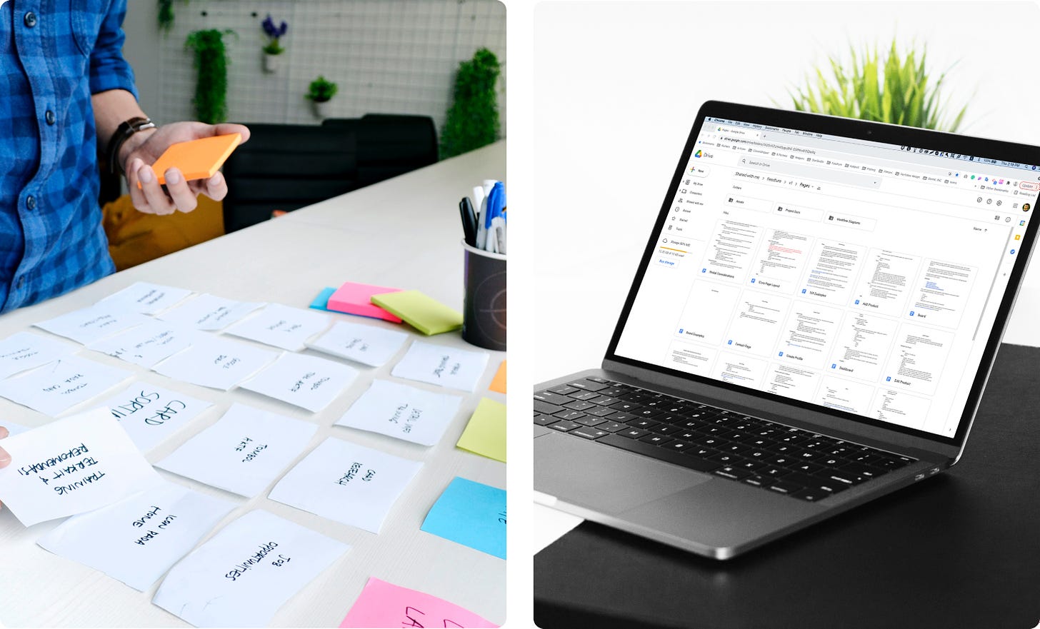
Analyzed 30 customer research documents to identify core user pain points
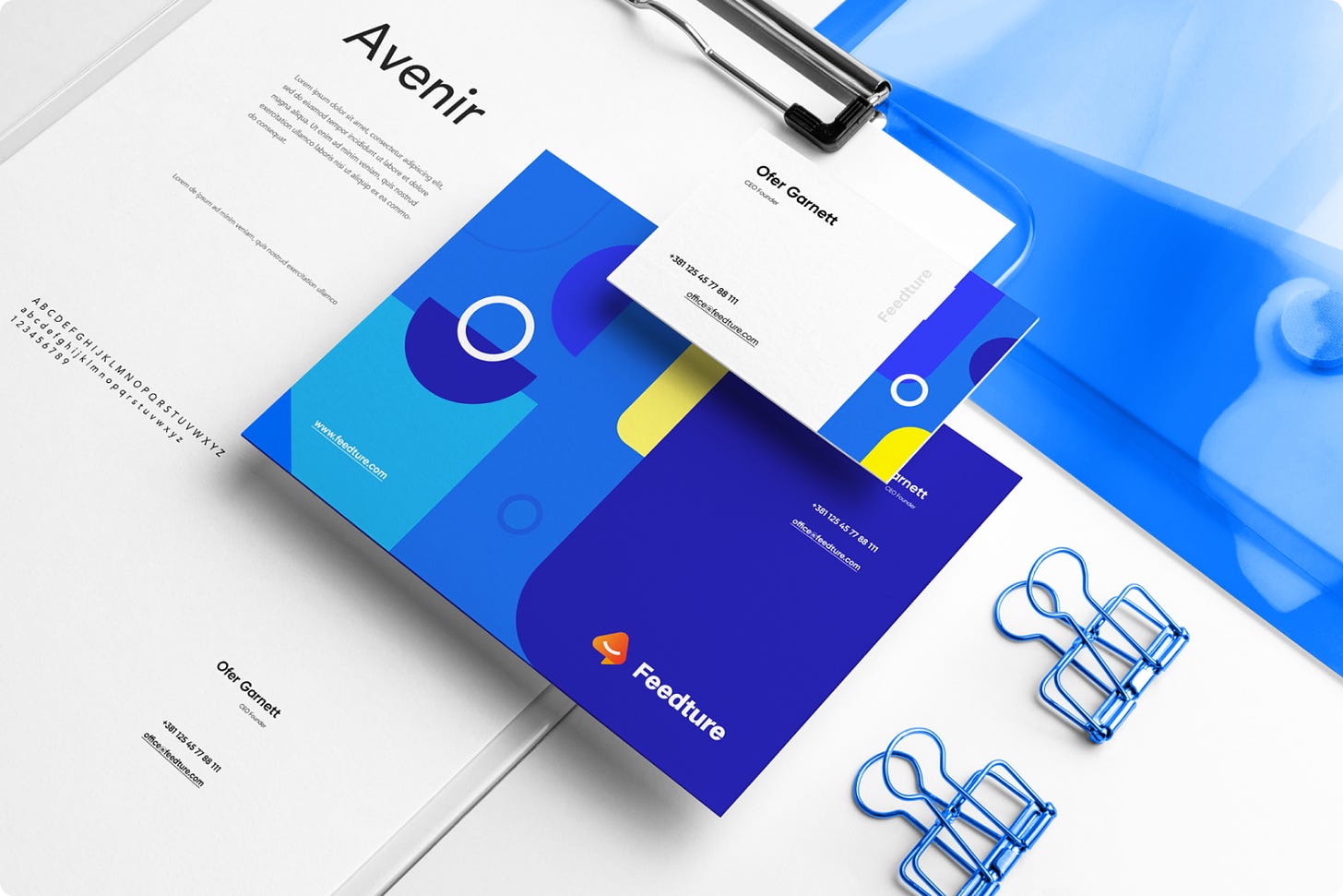
Created complete brand identity including logo design, animations, and visual language
Designed responsive layouts for both web and mobile platforms
Conduct usability testing sessions and improve the design based on the feedback received.
The beginning: I defined the process with a focus on brand identity.
It's great to feel positive vibes from the client at the start of a project. Ben is the kind of client who sees the value in design and guides us toward solving the problem at hand. Our first step was to define the design process. I presented my approach, which was adjusted slightly to prioritize Brand Identity, as the early-stage startup needed a landing page and logo as soon as possible.
Any beginning is hard. Whether we are building a house or a digital product, its foundation must be firm. That is the basis of everything.
In fact, 30 documents needed to undergo a thorough analysis, followed by my head-dive in Google Sheets and coming up with conclusions.
In the first phase, I began to analyze in great detail all the data that the client had gathered. By his facial expression, it seemed like there was a substantial amount of it, and I was quite right.
What I learned from the analyze
1. Negative reviews and grades on Google/App stores
You will often see Google/App stores being flooded with negative grades and reviews. They play a key role in determining the quality of a specific product, therefore the negative effect of overwhelmingly negative reviews is not surprising. Even after a couple of negative comments, the users tend to avoid a specific product.
SOLUTIONS: The owners of those products need a system of grading/reviewing which will not be linked with Google or Apple store.
2. Enormous churn rate
Many app owners complain about the fast rate at which their users stop using a specific app. The assumption is that one of the main reasons is the lack of communication between the product and its user.
SOLUTIONS: Customer reviews need to be sorted. It is necessary to sort the reviews by the needs and requests of the individual users.
3. Poor interrelation between a product and its users
Often enough the users feel the need to be identified with a specific product in order to use it. But also quite often that need is dismissed due to the complicated process of leaving a grade or a review in the form of a comment.
SOLUTIONS: Simplifying the entire process of the user connecting with the product in ‘’just a few clicks’’.
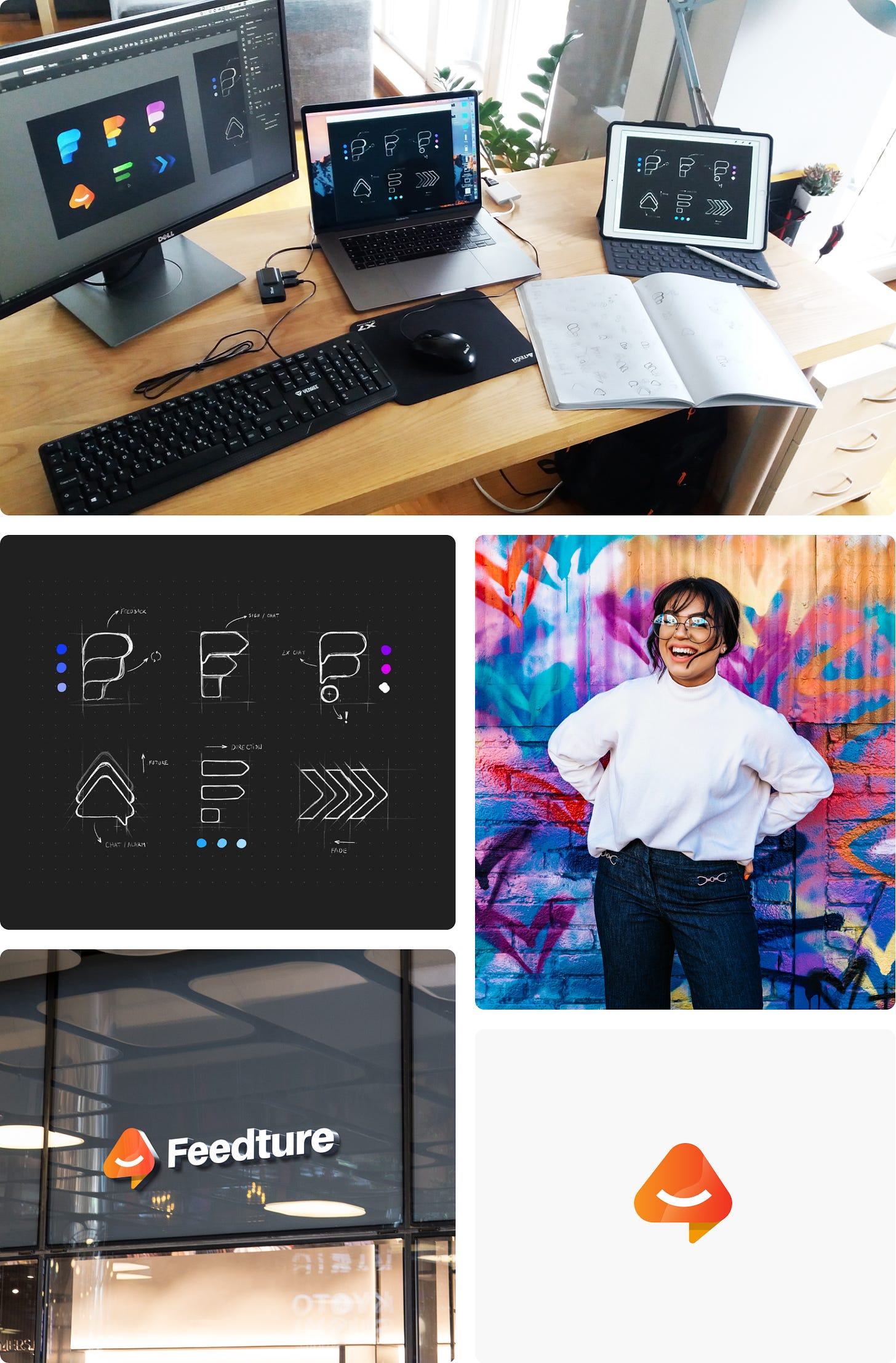
We created 6 logo concepts before finalizing the final one
Sometimes the idea for good branding happens quite quickly. But often enough, that does not seem to be the case. Exhausting brainstorming and sketching starts usually in a notepad, then transferring it to a digital device (IPAD), and then narrowing the choices down to usually 6 best ideas. The colors add a special final touch and complete the final look of the logotype.
Idea number 4 was something that fit best with one client’s requests and wishes. The logo of that idea was symbolized by a cloud, a button, and an arrow for positive feedback. Thoughts and emotions that they wanted to evoke: Happy, Engaging, Casual, Modern, Future. That was direct in the place! Emoji was added as a small detail of personification, and adding human characteristics to the logo. The trick is to make it simple, but engaging. The logo looked good in every size!
After the logo is agreed upon, everything else is pure enjoyment. From branding to illustration, to finishing with the logo animation. This is why I love this job! You are continuously surprised with each logo request. Not always in a positive way, but still, a surprise is a surprise! :D
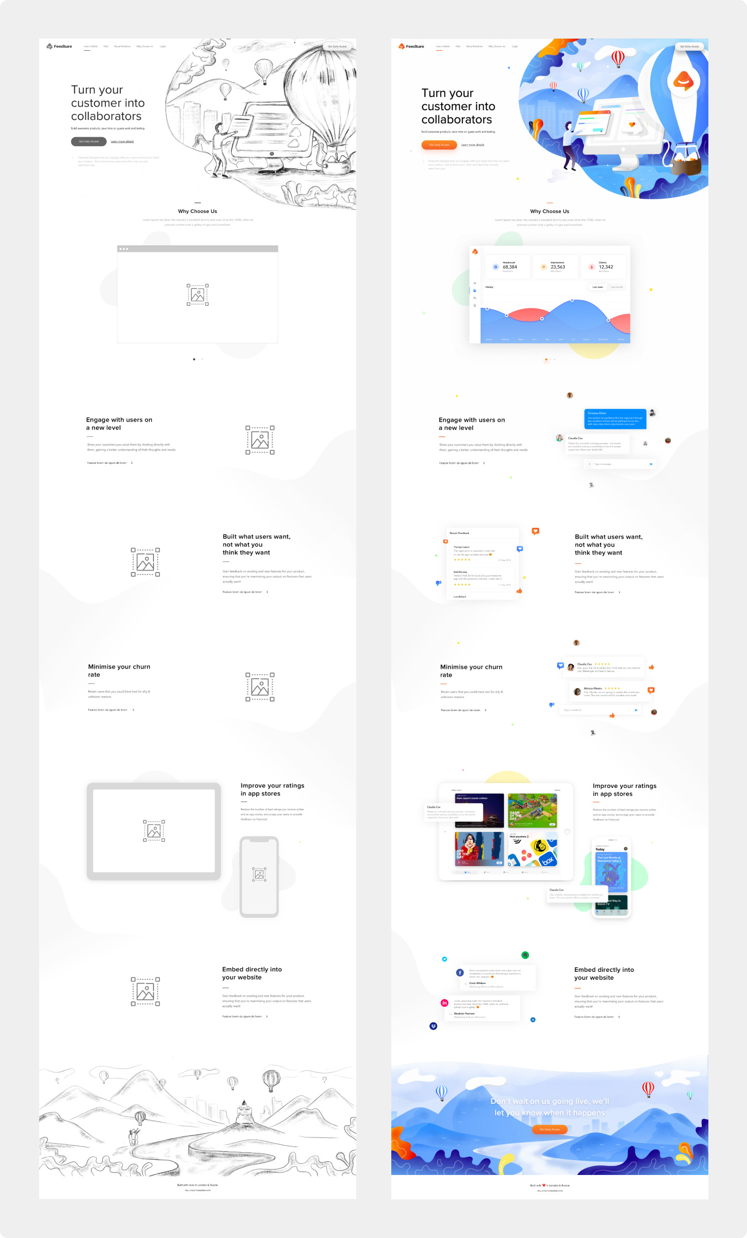
The landing page is always the best incentive for encouraging early subscriptions! Illustrations are always a uniquely creative solution.
Balloons as a symbol of the product, creativity. The sky is a symbol of freedom and improvement. Feedture is the fuel that runs your product, your balloon helps him fly and win the market!
Finally, it was time to design the product using the POV, How Might We, and User Flows methods.
The sentence that represents the ‘’point of view’’ of everything we have managed to gather and learn through user research:
“ Product owners can’t retain customers because there is no good connection between them, there is no good feedback - no response. “
The above quote was the basis for asking the following questions starting with ‘’How can we?’’, which helped in our idea-making process:
How can we create a place of good communication between a product owner and a potential user?
How can we improve their communication, and which factors influence the establishment of high-quality communication?
How can we make the entire process easily accessible?
How can we make the entire process simple?
How can we monetize the whole Feedture app?
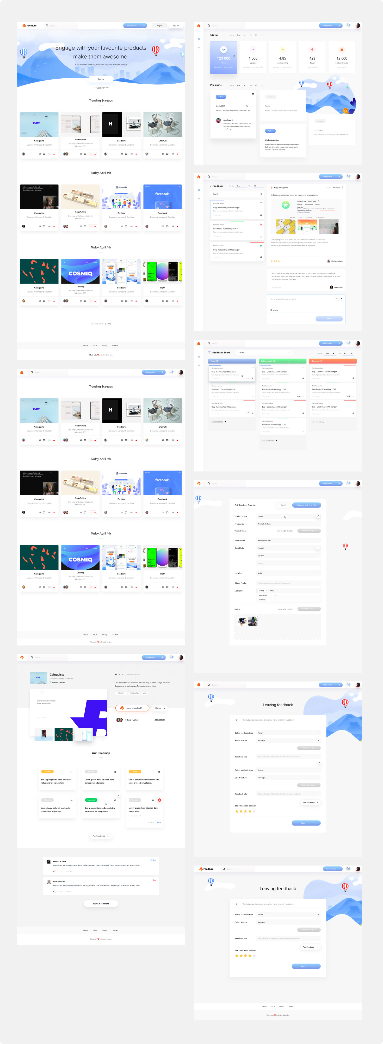
We have divided the entire app into a few bigger parts, then formed the general MVP with a few main functionalities, and finally started with the idea-making process and combining it with user flows for each of those segments.
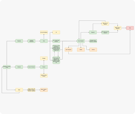
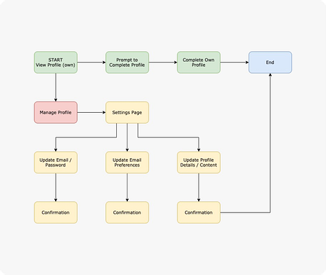
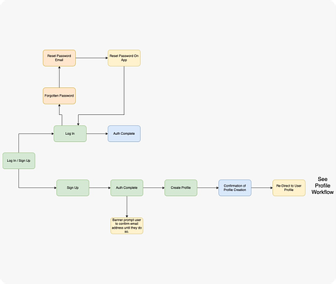

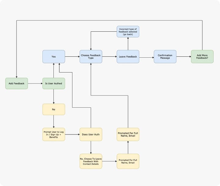
The biggest challenges during the wireframing phase were improving communication and simplicity of UX
The design process isn’t linear, so we frequently tested, revisited learning, and refined the wireframes.
Concrete actions to address the main challenge:
Creating a Space for Effective Communication
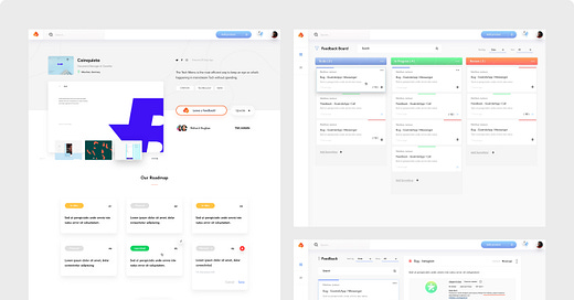
I created wireframes for a central "Feedback" section where users can leave comments, ideas, and requests directly to the product owners.
I designed intuitive ways for users to find the product they use and leave feedback, such as simple search or category navigation.
Improving Communication and Factors for High-Quality Communication
I enabled product owners to respond to user feedback directly within the app, establishing a two-way conversation.
I introduced options for users to track the status of their suggestions and be notified when the product owner responds.
I designed user profile pages where they can track their history of interactions and proposals.
Accessibility and Simplicity of the Process
I added intuitive calls-to-action and shortcuts to leave feedback from any page in the app.
I created a streamlined user flow for submitting comments, without unnecessary steps or complicated forms.
I designed responsive layouts optimized for mobile devices, making the process easily accessible to users on the go.
Monetization
I introduced wireframes for a premium/pro version with additional functionalities for the product owner, such as advanced analytics tools or user-base management capabilities.
I designed subscription models and payment options, integrated into the user flow and experience.
The results were quite satisfying! The client was positively overwhelmed! At that point, I was still a bit skeptical, because I knew that testing was still yet to follow. After a few completed phases, we transferred to adjustment of the whole app with the mobile device users.
Usability Testing and Improvements
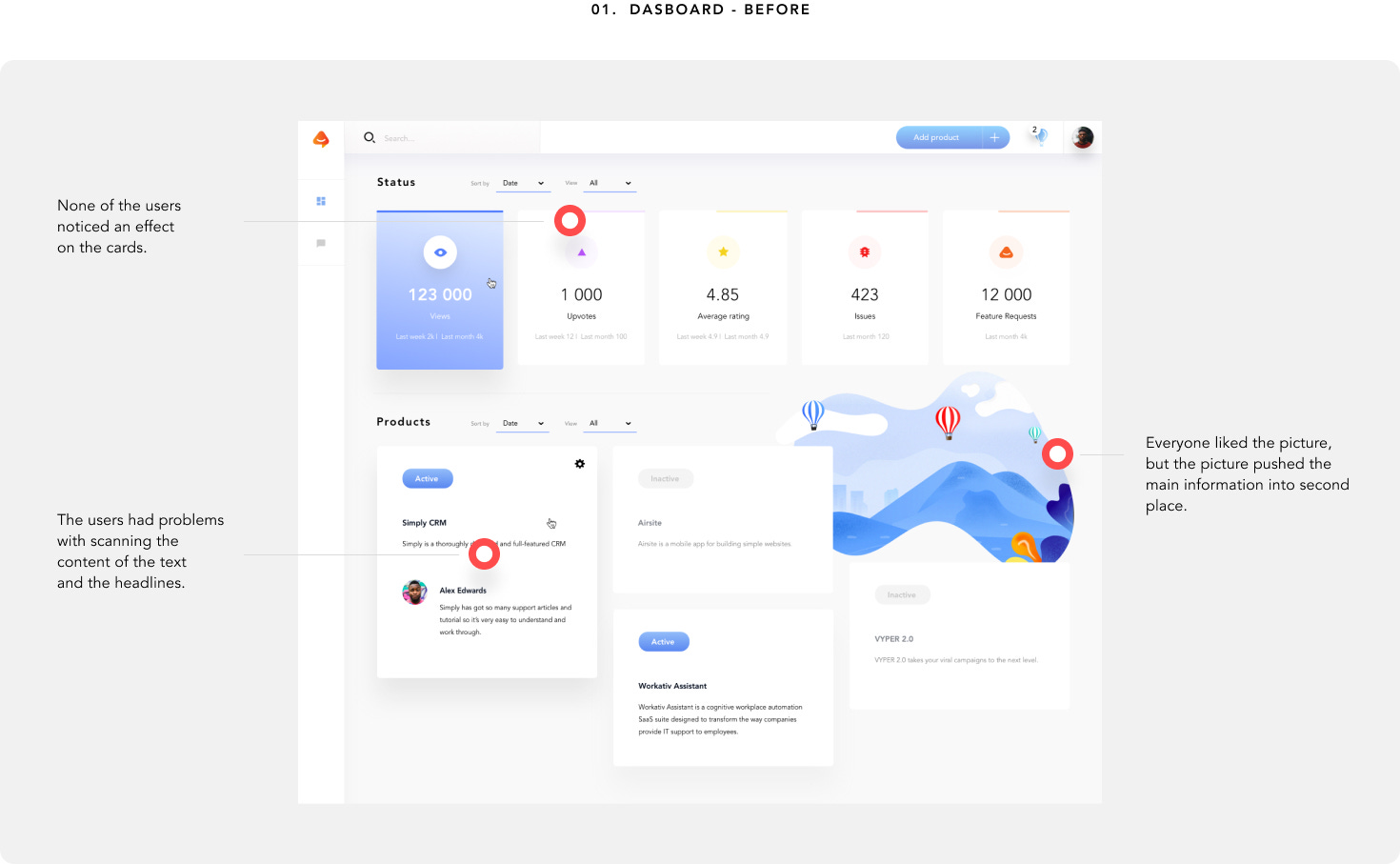
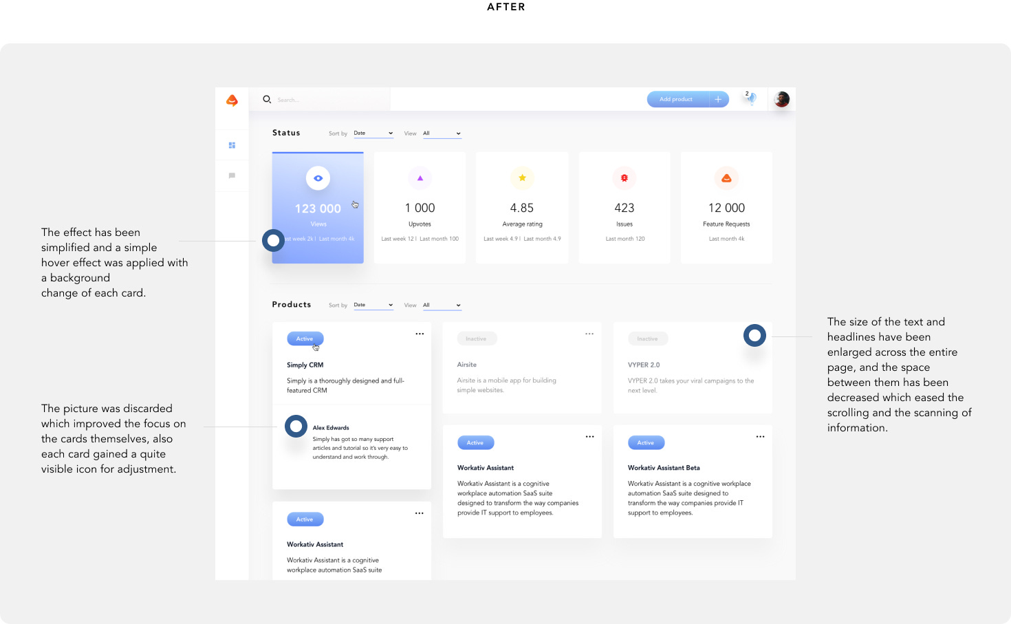
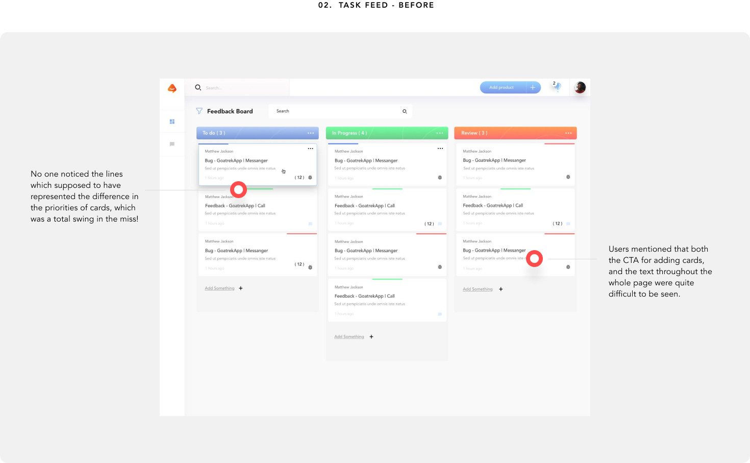
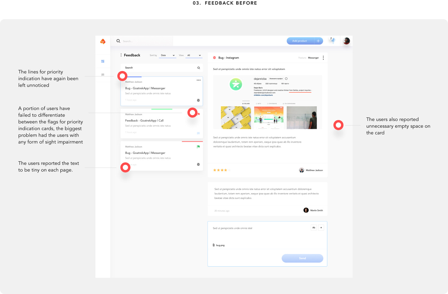
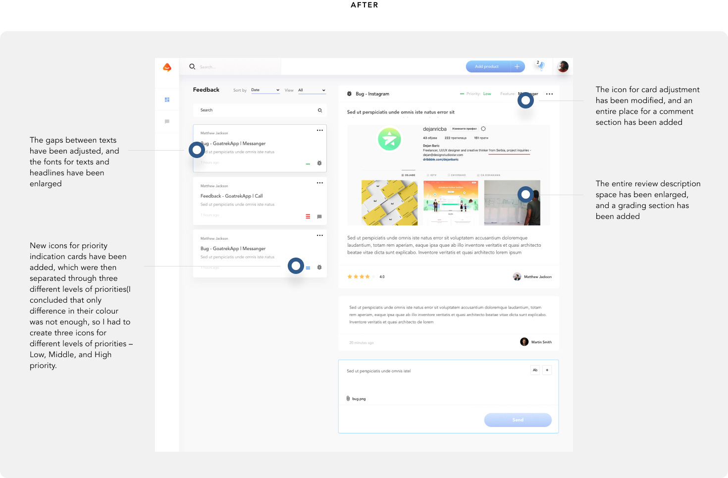
It was always interesting to me as a designer, to see how other people react to a design I created. In this specific case, the users already passed a specific flow, completed a task, and answered some of the questions we presented them with. Quite simple, yet fundamental testing (due to the lack of time) turned out to be surprisingly useful! The changes were then implemented, and with them, the user experience improved even more!
It is truly an unbelievable feeling when you complete a similar project starting from scratch!
After a few months of exhausting work, everything is ready to be coded, and the effort has paid off!
The most significant outcomes of the Feedture project
Higher Completion Rate: Increased user engagement, shown by a +65% completion rate.
Improved User Feedback: Users rated the feedback process at 8.5/10.
Enhanced User Experience: Refinements based on testing improved the product’s usability and appeal.
Efficient User Communication: Simplified user interactions, fostering better client-user communication.
Successful MVP Launch: Delivered a complete MVP with branding and a landing page, fulfilling the client’s main goals.
What I Learned Designing Better User Experience for an Early-Stage Startup
The importance of adjusting the design process is huge. Make the process flexible from the beginning to address real-time feedback and accommodate client needs.
The value of clear communication is enormous
Iterative testing and user flows highlighted essential improvements, emphasizing the need and usability
Congratulation! If you’ve scrolled this far, it’s a good sign! Below is my email and my website. I would love to hear from you. I typically reply in less than 24 hours.

