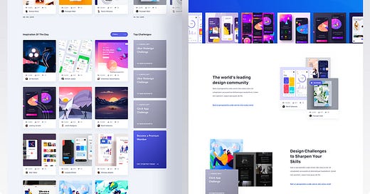
Case Study: Innnspire - How I Doubled Premium Engagement for This Design Community Startup in Just 2 Months
Lessons Learned Designing an Algorithm-Driven Platform to Showcase Design Excellence Over Popularity
About Innnspire
Innnspire was founded by a collective of art directors & designers who believed there was something missing in the digital sphere of design. Our mission is to collect, organize, and display the world’s best web/mobile/branding concepts in order to inspire your next project.
The Challange
Platform for talented designers that lack popularity/influence in the design community. Shifting the focus of the designs towards their quality, since most platforms favour old users. Simplifying the interface, and focusing on the projects.
To become a household name amongst designers. Space is always changing. Where you could sit for hours and absorb the essence of art, science, and emotion. A chamber of inspiration. Design challenges page. Increasing the premium paid membership deals.
What was my role as a Product Designer
Conducting competitor analysis and identifying key pain points to shape a user-centered design approach.
Developing wireframes and transitioning to UI design to focus on the platform’s core functionalities.
Creating a visually cohesive MVP that emphasized usability, branding, and highlighted quality content for increased user engagement.
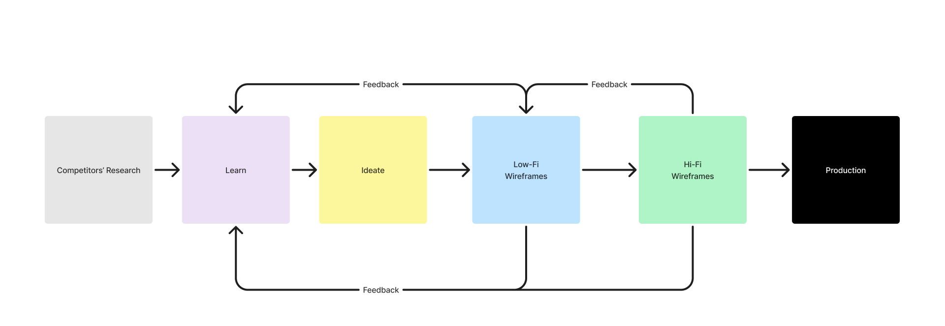
At the beginning, I collaborated with the team to establish a flexible process.
A small but mighty team of four - the visionary founder (Alex), strategic project manager (Martin), myself as Product Designer, and a dedicated UI designer (Igor) - proved that having clear roles and aligned design goals can turn an ambitious platform vision into reality, even on a startup timeline.
We skipped all early phases and focused only on competitors’ research
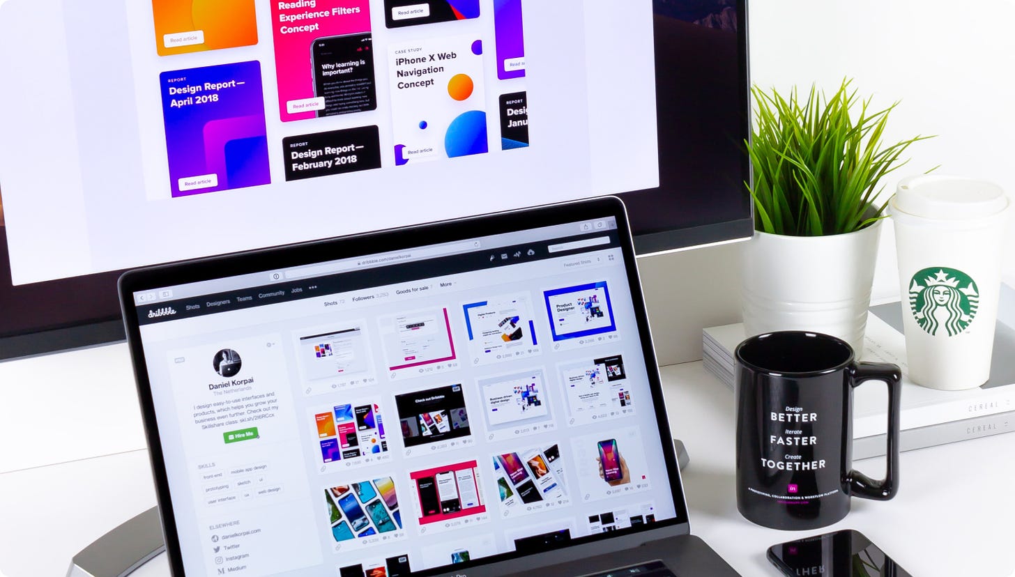
Since I’m also a part of the personas, have non-stop communication with my designer colleagues, and know all of our “pain points”, I proposed that the beginning phase should ONLY be focused on the analysis of our competition due to our short project deadline. I would single out the following platforms: Dribbble, Instagram, and Pinterest.
What I learned from competitors’ research
1. Dribbble
Pros: Very simple and fast posting of all projects and works. Rapid construction of a quality portfolio – within a short timeframe. The biggest benefit of the platform is to be able to search for designers using different filters and categories. A lot of clients.
Cons: The platform strongly favors old users, but the whole algorithm is lacking. It’s based solely on likes and follows. People with a high number of followers easily get to the front of the timeline, the others don’t stand a chance. Quantity usually takes precedence over quality. The Challange page is very rarely used and has quite a poor user experience. The design is also out of date.
SOLUTION: Create a platform based on a very strong algorithm and logic that will put the quality of the work first. Challenge feature.
2. Pinterest
Pros: A very good algorithm is used for searching through similar categories. A vast number of different interesting solutions. It’s a paradise for those who are creative types. It’s very simple to create, also to pin your own galleries. With decent speed, and perfect usability.
Cons: The platform seems bland, and doesn’t have good profile filtering. Link intermediary. Good for inspiration, but not so much for business.
SOLUTION: Simplifying the storage of projects in galleries, and simplifying the search of similar works. Search which is based on a visual similarity.
3. Instagram
Pros: Enormous popularity, with a vast number of people. Influencers with a high number of followers.
Cons: Portfolio limitations. Users not able to customize their own profiles. A very low organic reach, and the users have to pay for advertisements. A tremendous focus solely on the likes.
SOLUTION: “Moving” the likes, or hiding them, removing them from the central focus to the secondary focus.
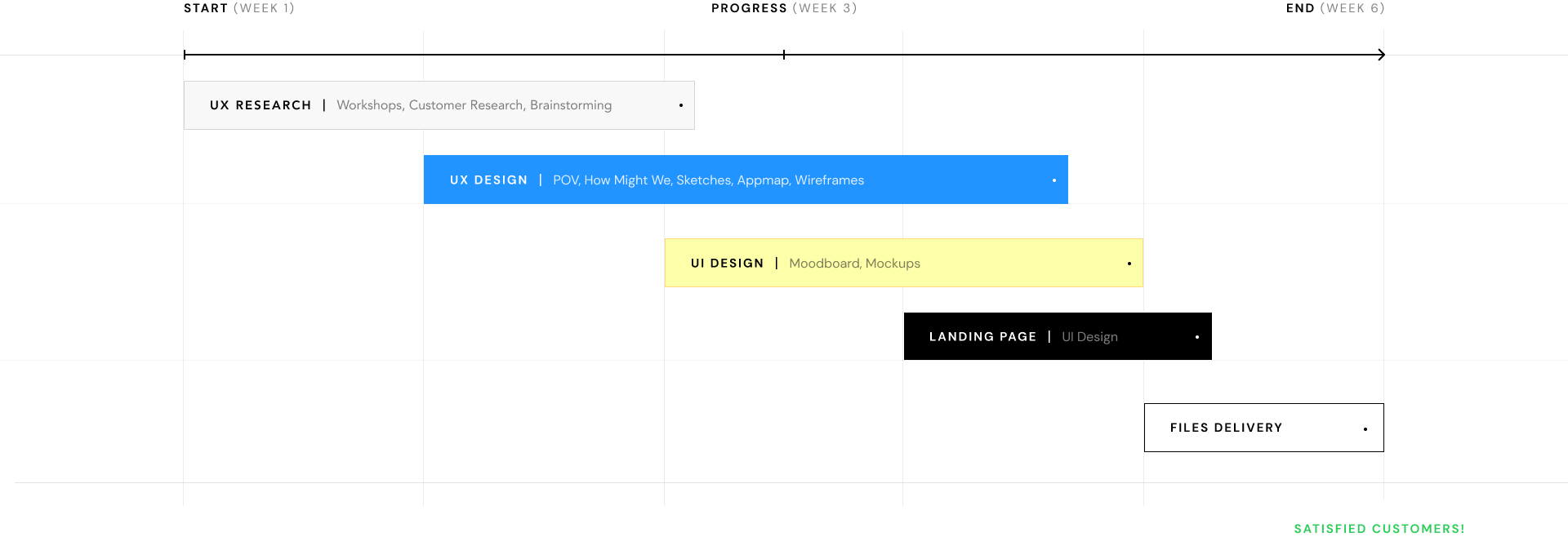
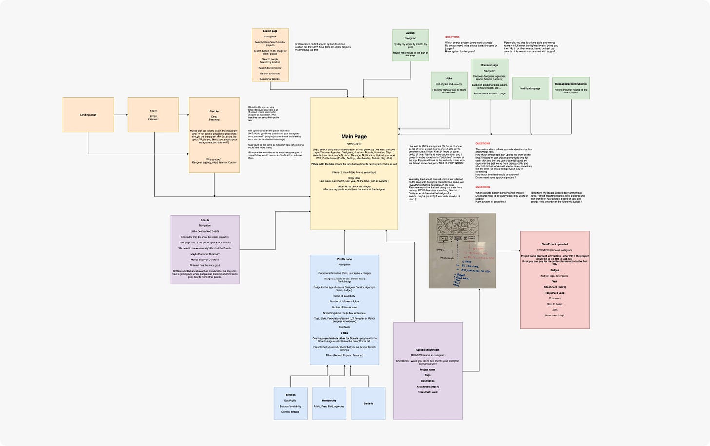
During the ideation phase, I used methods such as Point of View (POV), "How Might We" questions, and Appmap.
The sentence that represents the ‘’point of view’’ of everything we have managed to gather and learn:
“ Design community, which will put the quality of the work first. Without any kind of favoritism of users. A chamber of inspiration, learning, connection, and good energy. “
The above quote was the basis for asking the following questions starting with ‘’How can we?’’, which helped in our idea-making process:
How might we create logic in an algorithm that does not favor designers with a large number of likes or follows?
How might we put “likes” in a second plan?
How might we create a challenge page? Gamification of the challenge page?
How might we create logic related to the advanced search? Search by similar categories. (designer project or style)
How might we improve their communication, and which factors influence the establishment of high-quality communication?
How might we encourage the registration of premium paid users? Premium paid designers and premium paid clients?
We divided the entire app into a few bigger parts, then formed the general MVP with a few main functionalities, and finally started with the idea-making process and combined it with one big Appmap with the flow.
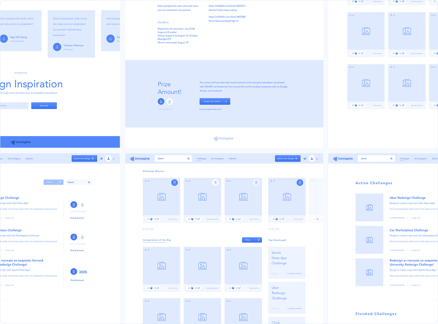
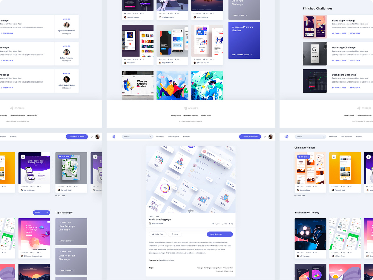
To address these "How might we" questions, we designed wireframes and high-fidelity screens that:
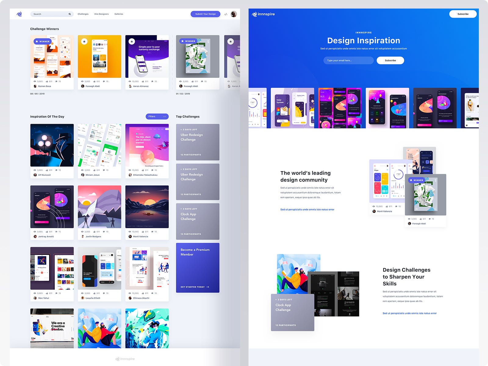
De-emphasized "likes" by focusing on the quality of user work(shot and showcase), not popularity, ensuring a fair algorithm.
Gamified challenges through interactive elements on the challenge page, encouraging participation.
Enhanced the search experience by categorizing similar styles and projects, making it easy for users to find specific designers.
Wireframes were done relatively quickly, and immediately after the initial internal testing, we switched to UI Design MVP. The focus was on the several main pages where Home was the most challenging. It demanded the designing of a timeline and a business model with the premium users.
From Skepticism to 8.5/10: Proving Success Against the Odds
The project led to increased premium user engagement and boosted conversions for membership subscriptions. Improvements to the algorithm ensured that high-quality content was highlighted, and the platform's design received positive feedback. (8.5/10 on first 50 reviews)
A two-month sprint with an early-stage design platform taught me
Fast now, fix later" isn't always the most efficient approach
Direct experience with the pain points helped make informed decisions even without formal user testing
Understanding that true UX innovation sometimes means going against established patterns
Congratulation! If you’ve scrolled this far, it’s a good sign! Below is my email and my website. I would love to hear from you. I typically reply in less than 24 hours.

